

The Project
Go Cruelty Free is an app to shop cruelty free products online and was developed during the CareeFoundry UI Design Program.
My Role
UI /UX designer and Graphic Design
Tools I used for the Project
-
- ArtstudioPro on the iPad Pro for the Low Fidelity Wireframes.
-
- Adobe XD for the Mid and High Fidelity Wireframes.
-
- Adobe Illustrator and ArtstudioPro for designing the logo.
-
- Adobe Photoshop for creating the Mockups and editing the product images.
-
- Lucid Charts for creating the Flow Diagram.
As part of the CareerFoundry UI Design Programm, we were asked to design an e-commerce app.
"Go Cruelty Free" the easy way to shop cruelty free products. It is designed as a responsive web app and can be used on mobile, tablet and desktop
We believe no animals should suffer from animal testing. It can be difficult and time consuming to navigate your way through the jungle of products to find companies that are cruelty free.
Our promise and our mision is to make it easy to shop cruelty free without spending hours of research to find cruelty free products.
All products in our store are exclusively from cruelty free certified companies.


The Idea
When being tasked to design an e-commerce app as part of the CareerFoundryn UI Design Program, i immediately decided to design an app for exclusively cruelty free products. It has been an important personal consideration for years to only buy products that are not tested on animals. After moving to another country, not knowing any of the cruelty free brands here, I know how much time it can take in a store to google search each and every single product to see if it is tested on animals or not. How much easier and time saving the shopping experience would be with an app only selling certified cruelty free products!
Design Process
User Stories
I started with user stories to understand the user's needs which is crucial to create a user-centerd design.
-
- As a new customer, I want to access the inventory without having to register, so that I can make sure this store has what I am looking for before having to create an account.
-
- As a customer, I want to be able to place multiple items in a shopping cart, so that I can purchase more than one item at a time.
-
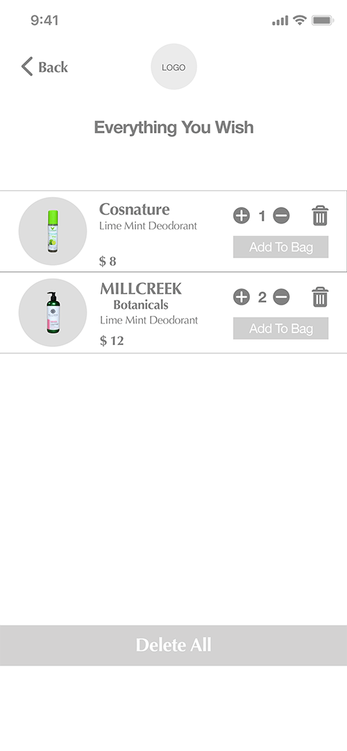
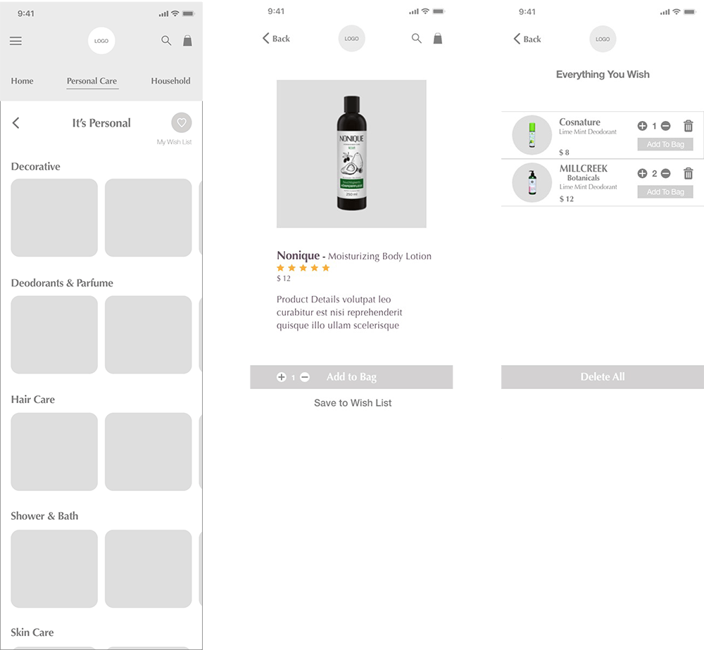
- As a returning customer, I want to be able to save items that I cannot buy right away to a wish list, so that i can purchase them at a later date.
-
- As acustomer, I want there to be a variety of payment options, so that I can choose the payment method that suits me best.
User Flow and Low Fidelity Wireframes
From the user stories I then created the flow chart using Lucid Charts. Mapping out the user's journey through the app is essential to identify possible pain points early on to ensure a smooth and easy experience for the user. Time to sketch out the low-fidelity wireframes! I usually draw on my iPad Pro using ArtstudioPro.
Flow Diagram

Low - Fidelity

Mid - Fidelity
Based on my sketches I created the mid-fidelity wirframes in Adobe XD.
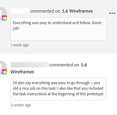
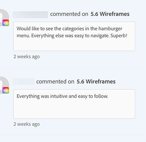
User Testing
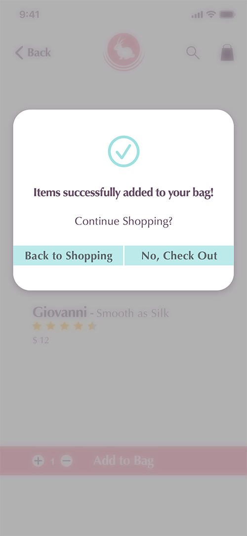
Before starting to work on the final design, I conducted user tests with the finished mid-fidelity wireframes. I utilized the Adobe XD prototype tool for the tests. None of the participants had major problems performing the tasks, so that I could move on to the high-fidelity wireframes.
Final Design
Thinking about the final design, I quickly decided to go with warm and friendly colors on a white background. The overall feel of the UI should be warm, friendly and inviting.
Colors
Friendly, warm and inviting are the key characteristics for the color scheme. The primary and secondary colors should not be modiefied, while the accent color can be changed but should stick to the color harmony.
Primary
Secondary
Primary
R250 G245 B240
H30 S4 B98
R240 G227 B218
H25 S9 B94
Secondary
R156 G227 B218
H347 S36 B96
R244 G139 B162
H347 S43 B96
Neutral
#FFFFFF
R255 G255 B255
H0 S0 B100
#BEB3BE
R190 G179 B190
H300 S6 B75
#694F68
R105 G79 B104
H302 S25 B41
Accent
#9FE0E0
R159 G224 B224
H180 S29 B88
Texture
This texture can be used for backgrounds in low contrast, only within the primary or secondary spectrum.

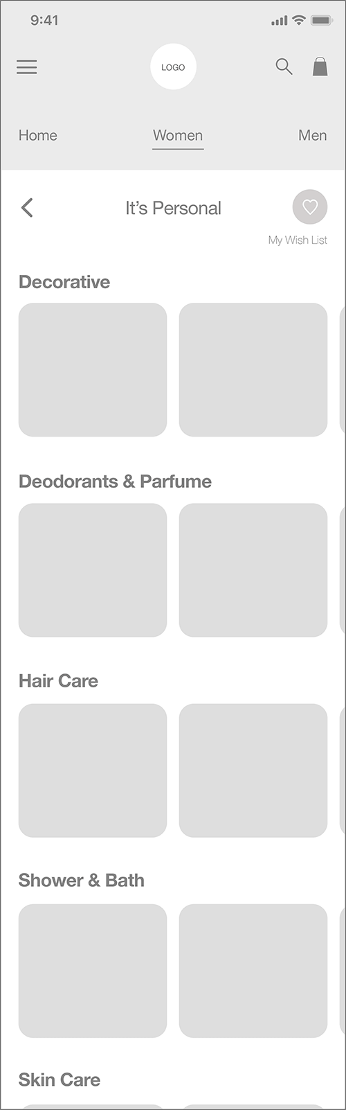
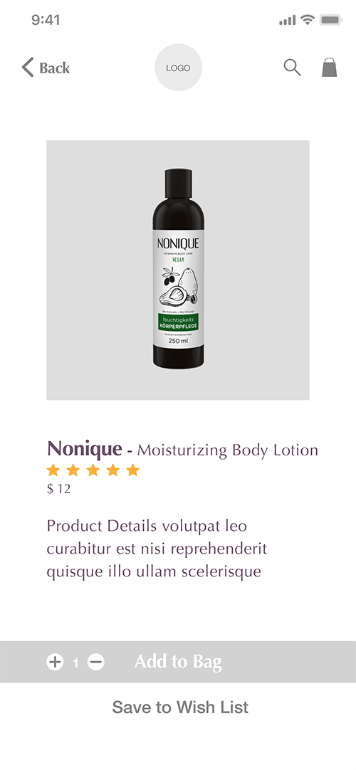
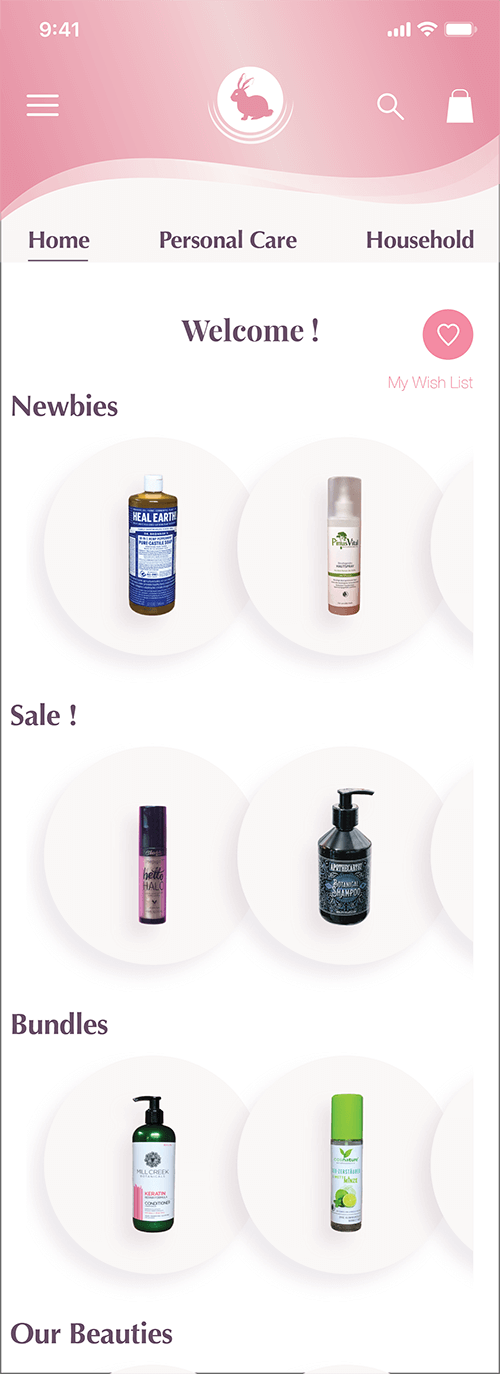
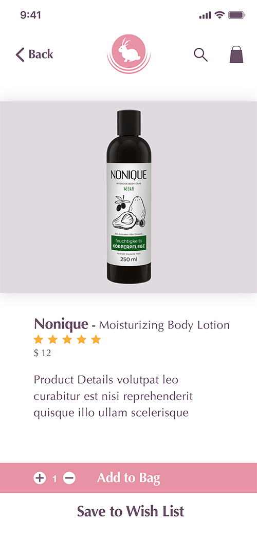
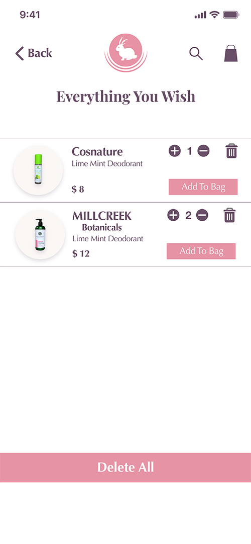
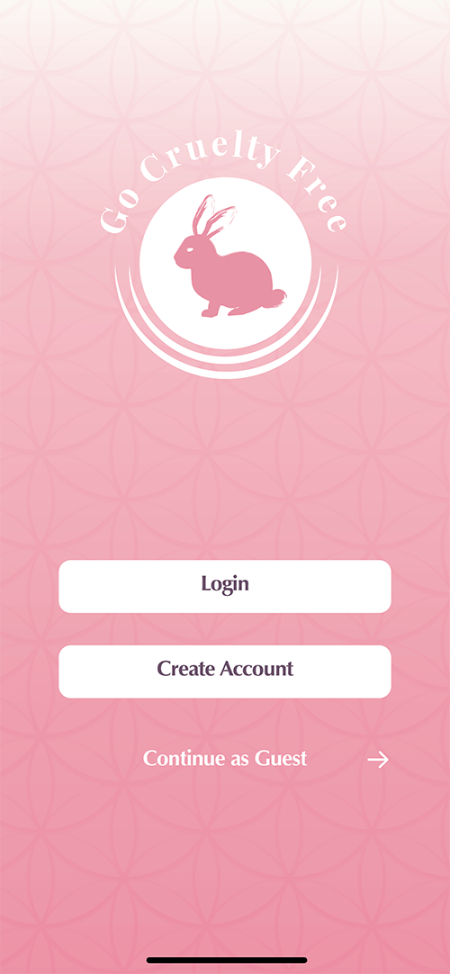
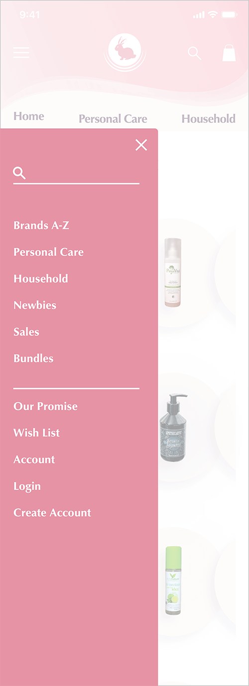
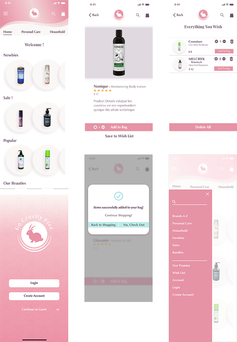
The Final Screens
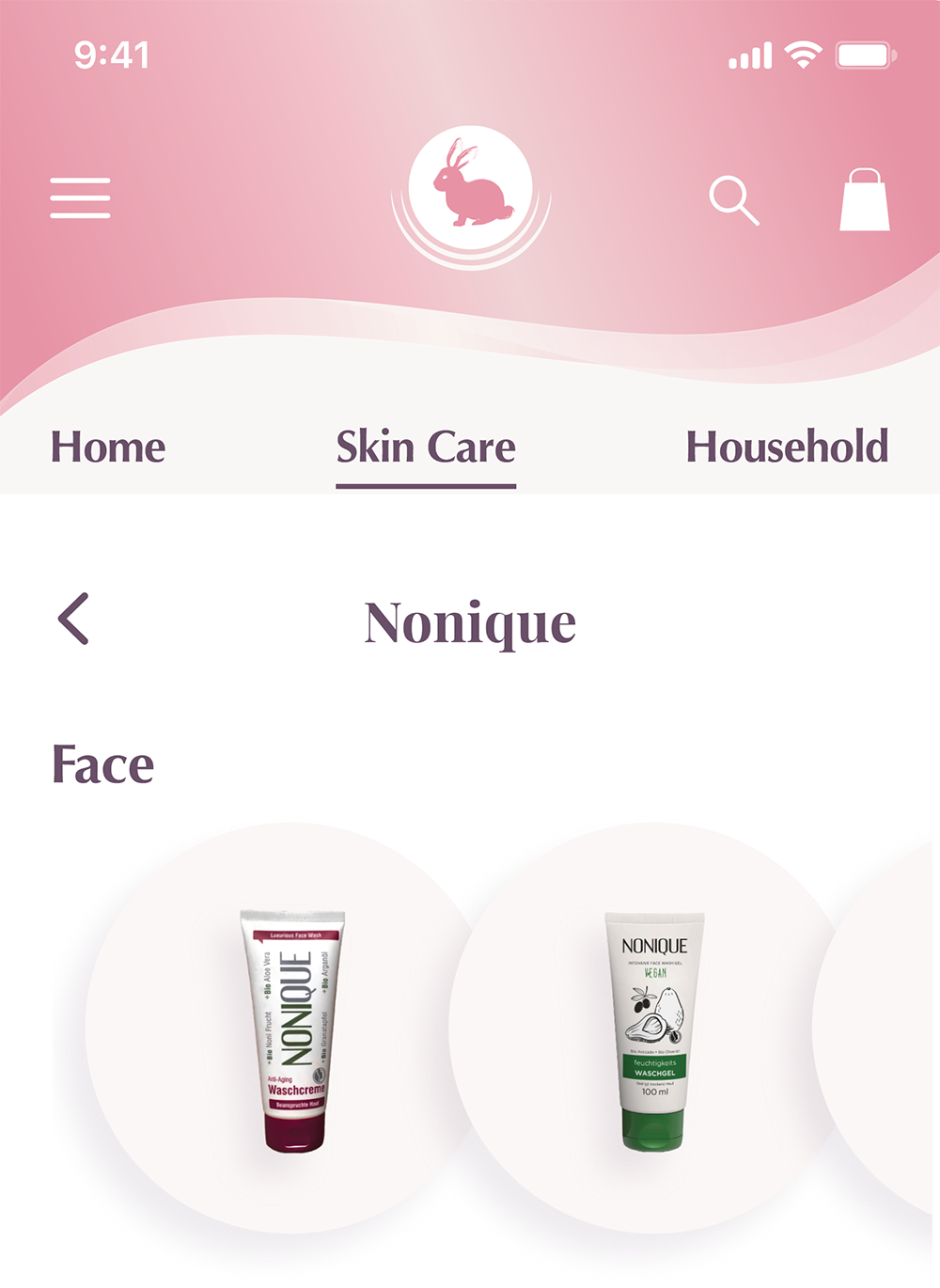
Typography
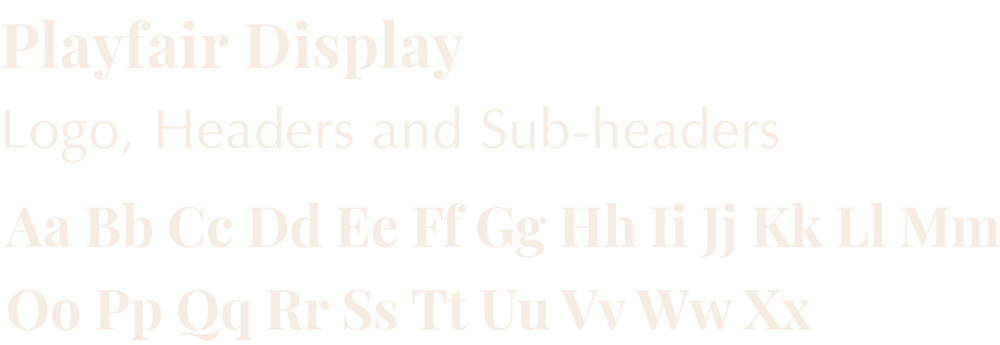
For the Typography I wanted something playful for the headers. For the titles and all body text I decided on a sans serif font. The Playfair Display font for the headers, Classico URW for the titles and body text is a perfect fit.

The logo
Designing the logo was a great opportunity to utilize my art and graphic design skills using ArtstudioPro for the initial sketches, and Illustrator for the final vector graphic. The idea for the logo was to stick with the well known image of the bunny representing cruelty free products, but also create a unique and individual logo.
THANK YOU!
